
VIVIAN NGUYEN
Mrs.Comacho
CTE Training & Transitions
Period 1

The first time I typed on a keyboard must of been around first or second grade. In this section, I was mostly comfortable with typing because of the games and lessons I did when I was younger.
Assignments fall 2017:
CTE Career training & Transitions webpage:

8/4/17: My Genre


The photo genres that I chose were food and nature. I chose these because they both have a sense of beauty and style. What I like most about these photos are their colors. The food image had a bright red watermelon which stood out to me, and the nature image had bright pink flowers, which popped out of the other green plants. When I looked over the pictures I took in the past, they mostly consist of food pictures, and landscape/nature genres. I find both of these interesting topics to capture.


08/09/17: Composition Through My Lens
1rst photo: This photo has good composition. I think that it applies the rule of thirds. The background is not busy, and the focus point is not in the center. Also, the lighting creates a like division, which is something not everyone will notice.
2nd photo: This photo demonstrates bad composition. The main focus point (peacock) is right in the center, and the background is a little distracting from the sidewalk. This image could of been rule of thirds. The peacock would be cropped off to the side, and the sidewalk would be edited out. I think that doing so would make the image more impactful, since all of the distractions have been eliminated.
8/11/17: Applying the Rule of Thirds (ROT)


This image may look beautiful to you...but not to the eyes of a photographer. According the the Rule of Thirds, (ROT), the focus point cannot be in the center. In this image, it is clearly breaking the rule. The person is directly in the center.
This is how the image should look like after it's finished. Compared to the original image, this one is more zoomed in, and you can see the main focus point, including all the small details. There's room to see the scenery in the back, and the focus point is set on the side, not blocking the view. The ROT gives us a perspective of everything in just one shot.
To fix the image, I cropped it into 3 x 3 graph. The idea of this was to get the focus off to the side, where the squares meet, as seen above. The image is also zoomed in more.
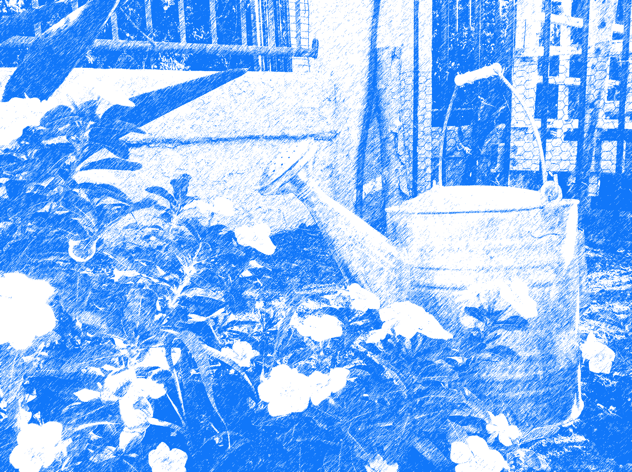
8/17/17: The 7 Elements of Art Through My Lens:
 Lines | 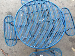 Shapes |
|---|---|
 Form |  Texture |
 Space |  Value |
 Color |
The first image represents line because the shape of the wall creates a strait line from one point to another. The second image represents shape because the table is in a shape of a circle. The third image represents form because the subject (watering can) is three dimensional. The forth image represents texture, the tree trunk in the photo has a lot of detail. The fifth image is space, since the subject (tree) is looking in the distance at a scenery. The sixth photo is value because it gives a balance of two colors, black and white. The seventh photo is color, because one color (green in this case) stands out.
8/22/2017 - Digital Editing GIF

This assignment consisted of challenging instructions, and required attentive listening. We had to understand how to manipulate all the images, create a frame for each one, and combine all of them into one GIF. I knew that using a high tech app such as photo shop would be complex, so I made mental notes when Mrs. Comacho was explaining. Doing this before hand helped me remember all the steps and how to do it. In the photo, I copied and pasted the image four times, and then added a unique filter for each separate photo. A filter that I used was a graphic filter, made the photo look like it was drawn by hand. I think the GIF is more of a sophisticated picture, rather than the "before" image. It gives a different perspective and color to the image, and a new personality and texture. This image connects to the real world, because lots of people produce a GIF. I've seen these on the internet all the time, from Google Images, to websites. Some GIF are moving images, and can create a mini repeating animation inside of the photo. From this project, I have learned how to make a simple GIF.
8/24/17 - My Name - Alphabet Photography


This image represents the letter V. The tree's branches split at the half way point of the image, and creates a V like shape.
This is the letter I. I took a picture of a cactus that seems to represent an I.
I thought that the ceiling fan made a decent V, so I took a picture of half of the fan that portrayed an image of a V.
This is an image for the letter I. I noticed that the watering-can intercepting the hose sort of looked like an I with a dot.
This is an A. It was a base of a plant supporter from our garden, and I thought that it looked like an A.
The letter N is represented in this photo. One of the chairs in our garden looked like an N with out the short line on the left. The brick on the left represent the line.
09/01/2017 - Me My Color and I

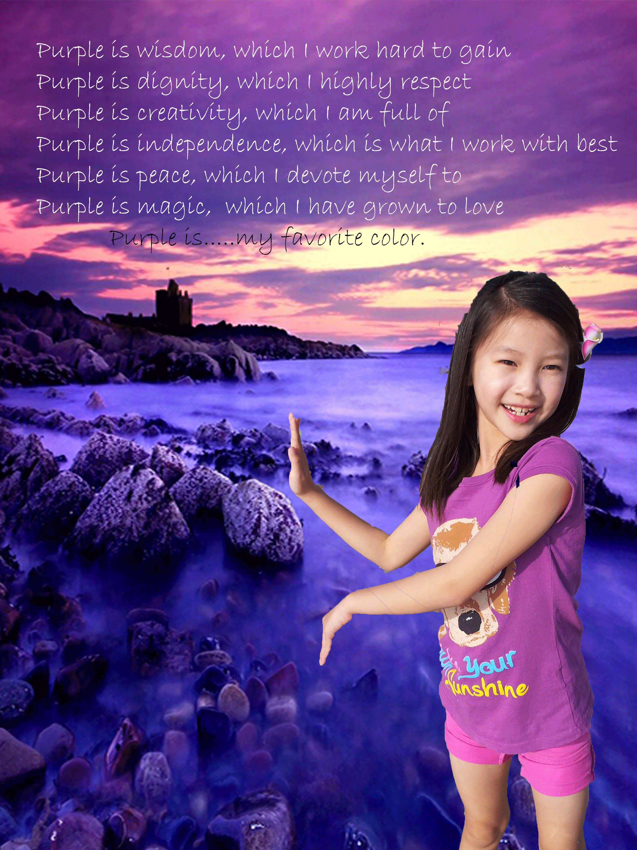
This assignment consisted of heavy instructions and memorization. It was more challenging than the rest in my opinion, this assignment took me longer to finish than the previous ones. There were many steps to create this image. I chose a background associating with the color I picked, and an image of myself. From there, you would set the "new" settings for 8 width, 8 height, and 36 resolution, place those images into Photo Shop, quick select the image of yourself, and inverse delete. Then, you would adjust the image of yourself to the background image, and then add text and hue. I used all of the listed features, to manipulate the image into how it looks like now. Compared to the images before, this new image conveys a more calm setting. It does not look as realistic as the original image did, but it does create a more quiet setting, without a busy background as it did before. This assignment connects to the real world, because there are jobs for these type of photo editing. Some people do these for ads, to make something look more appealing, and some, for pure entertainment. I've seen these on TV, websites, and in many other places in the real world.
09/11/2017 - Camera Frames


Extreme long shot Long shot Medium shot


Medium close-up Close up Extreme close up
This assignment consisted of six different camera frames: Extreme long shot, long shot, medium shot, medium close-up, close-up, extreme close-up. To capture these images, I had to know what each frame was, and I did so by reviewing an interactive power point. An extreme long shot is a picture taken very far away, it is used to give a vague impression of the scene. The subject may not be visible from that frame yet. Long shot is a picture taken from "head" to "toes" of the subject, showing more detail. The subject does not have to be a human, it can be an object, like the ones above. Medium shot is a picture of the subject from the middle and up. A medium close up is almost the same, but it is from the "shoulder area", and up. A close-up is a picture of the subject from the "chin" to "forehead". An extreme close-up is a very close shot of the subject, and you can not see the background at all. This assignment connects to the real world because these frames are used in real movies. Our class reviewed a movie, and we connected some of the scenes taken to these frames, and I realized that each shot that was taken was a camera frame. The movie switched around different frames, which gives us a different perspective of the subject.
10/10/2017 - Camera Angles


Bird's Eye View High View Eye Level


Low View Worm's Eye View Oblique Angle
A bird's eye view is an image over-viewing the subject up above. High view is taken above the subject to make them look "swallowed up" by the scene. Eye Level is taken at the same level as the subject's point of view, or in other words, at their "eyes". Low angle is taken below the "eyes" and can impact the view of the subject. Worm's eye is when the photo is taken at the bottom the the subject's feet, and makes the subject look stronger and more powerful. Canted/oblique is when the photo is taken at a diagonal angle, and makes the photo look like it's in motion. This assignment can be applied to the real world because it is used in movies. For example, the worm's eye view can make the subject look bigger, so when there is a powerful subject coming, the director can make them look stronger and more scary. This assignment benefited me because now I know how to apply these camera frames into the photos that I take. With this, I can convey more emotions into the photos to show either fear, power, etc. I have noticed these frames used in films and movies as well, and I can identify them. Now I know what angles directors in films.
10/18/2017 - Shutter Speed


1/50 1/500 1/1000
This image of a Slinkey in motion was taken with a 1/50th of a second with shutter speed. The subject itself is very blurry, in which of result of the slow shutter speed.
This photo had the same subject, but was taken at a faster shutter speed, which as 1/500th of a second. The subject is more focused, but still shows some motion. It is not completely "frozen" in midair yet.
This image is similar to the previous images, yet it is more clearer than the rest. This is because it was taken with a shutter speed of 1/1000th of a second, which made the photo appear as if it was still.
10/25/2017 - Aperture


FS 4.5 FS 11 FS 25
This image was taken at a 4.5 aperture. The background is more blurry than the other pictures, and the subject is more clear. There is not much detail to see in the background since it is blurred out in result of a lower F stop and higher aperture.

This image was taken at an 11 aperture. The background is less blurry than the previous image. The background gives a small idea of what the scene behind of the subject is like.
10/30/2017 - ISO

This image was taken at a 25 aperture. The background and the subject are both focused. The viewer can see all the detail in every spot clearly as a result of the higher F stop and lower aperture.

1600 ISO 400 ISO 100 ISO
This photo was taken with a very slow shutter speed and a high ISO of 1600 in manual mode, which over-exposed the image by giving off too much light. The whole image is mostly white, you can barely see the cars.
This photo was taken with a 1/200 shutter speed and 400 ISO in manual mode, which correctly exposed the image by giving off the right amount of light. You can see the whole image with color and the setting.
This photo was taken with a very fast shutter speed and a low ISO of 100 in manual mode, which under-exposed the image by giving off too little light. The whole image is almost pitch dark, causing the scene to look like night.
11/02/2017 - Camera Settings Chart

11/08/2017 - Humans of BVM Video
My Channel
My Channel


1080p
